 ORIONFOLD
All elementsFlow Elements / Components · 15 elements
Fifteen blocks a document can hold, each written as a few plain lines
Fifteen blocks a document can hold, from a checklist a client signs to a chart beside its figures. Each stays plain text.
Components1 of 15
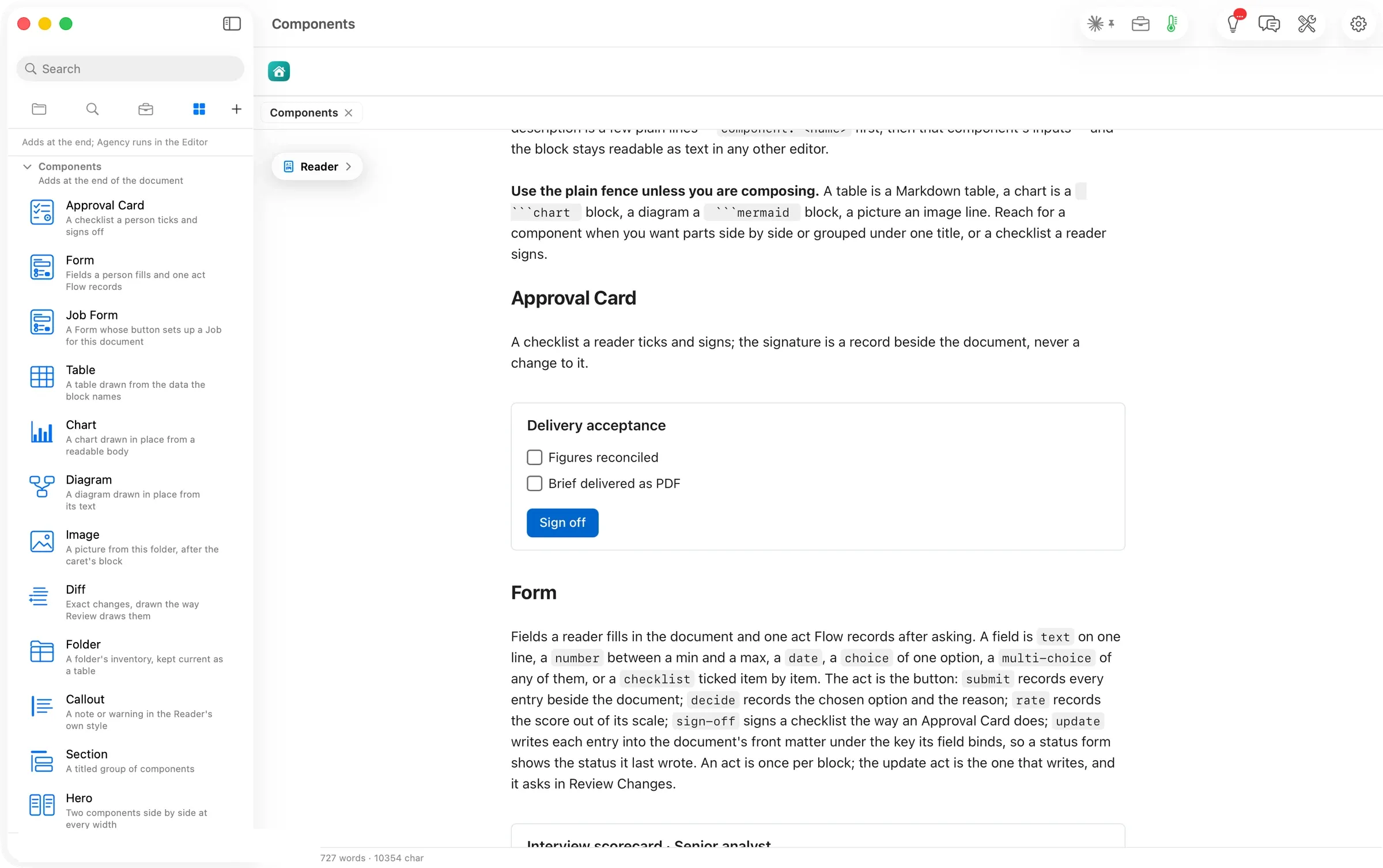
Approval Card
A checklist a person ticks and signs off.
Signing writes one record beside the document; the document’s text never changes.
```flowui
component: Approval Card
title: Delivery acceptance
items:
  - Figures reconciled
  - Brief delivered as PDF
decision: {label: Sign off, action: sign-off}
```
Drawn: the title, a box per item, and a Sign off button.
Components2 of 15
Form
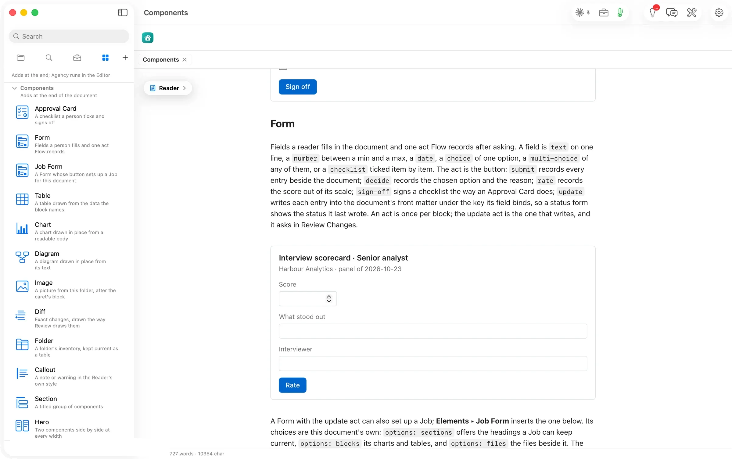
Fields a reader fills in, and one act Flow records after asking.
A field is text, a number between a minimum and a maximum, a date, one choice, any of several, or a checklist. The act is one of five. Submit records every entry beside the document, decide records the chosen option and the reason, rate records a score, sign-off signs like an Approval Card, and update writes each entry into the document’s front matter, through Review Changes.
```flowui
component: Form
title: Interview scorecard · Senior analyst
subtitle: Harbour Analytics · panel of 2026-10-23
fields:
  - {label: Score, bind: score, type: number, min: 1, max: 5}
  - {label: What stood out, bind: note}
  - {label: Interviewer, bind: signer}
decision: {label: Rate, action: rate}
```
Components3 of 15
Job Form
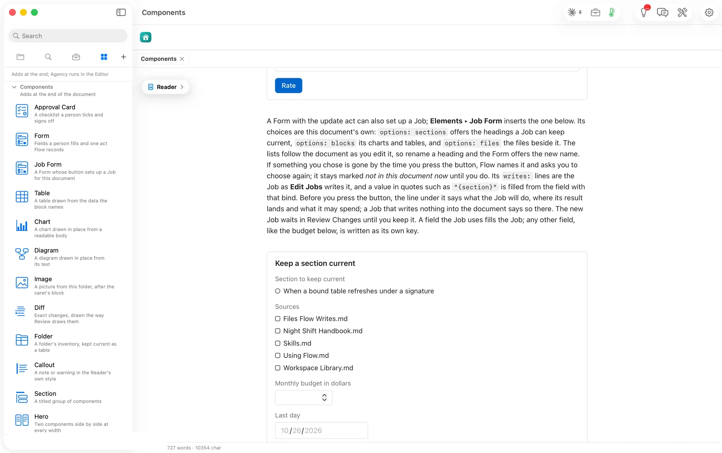
A Form whose button sets up a Job for this document.
Its choices come from the document itself. options: sections offers its headings, options: blocks its charts and tables, options: files the files beside it. The lists follow the document as you edit it. The new Job waits in Review Changes until you keep it.
```flowui
component: Form
title: Keep a section current
fields:
  - {label: Section to keep current, bind: section, type: choice, options: sections}
  - {label: Sources, bind: sources, type: multi-choice, options: files}
  - {label: Monthly budget in dollars, bind: budget, type: number, min: 0, max: 20}
  - {label: Last day, bind: until, type: date}
decision: {label: Set up the Job, action: update}
writes:
  jobs:
    - kind: expand-with-sources
      section: "{section}"
      sources: "{sources}"
      until: "{until}"
```
Components4 of 15
Table
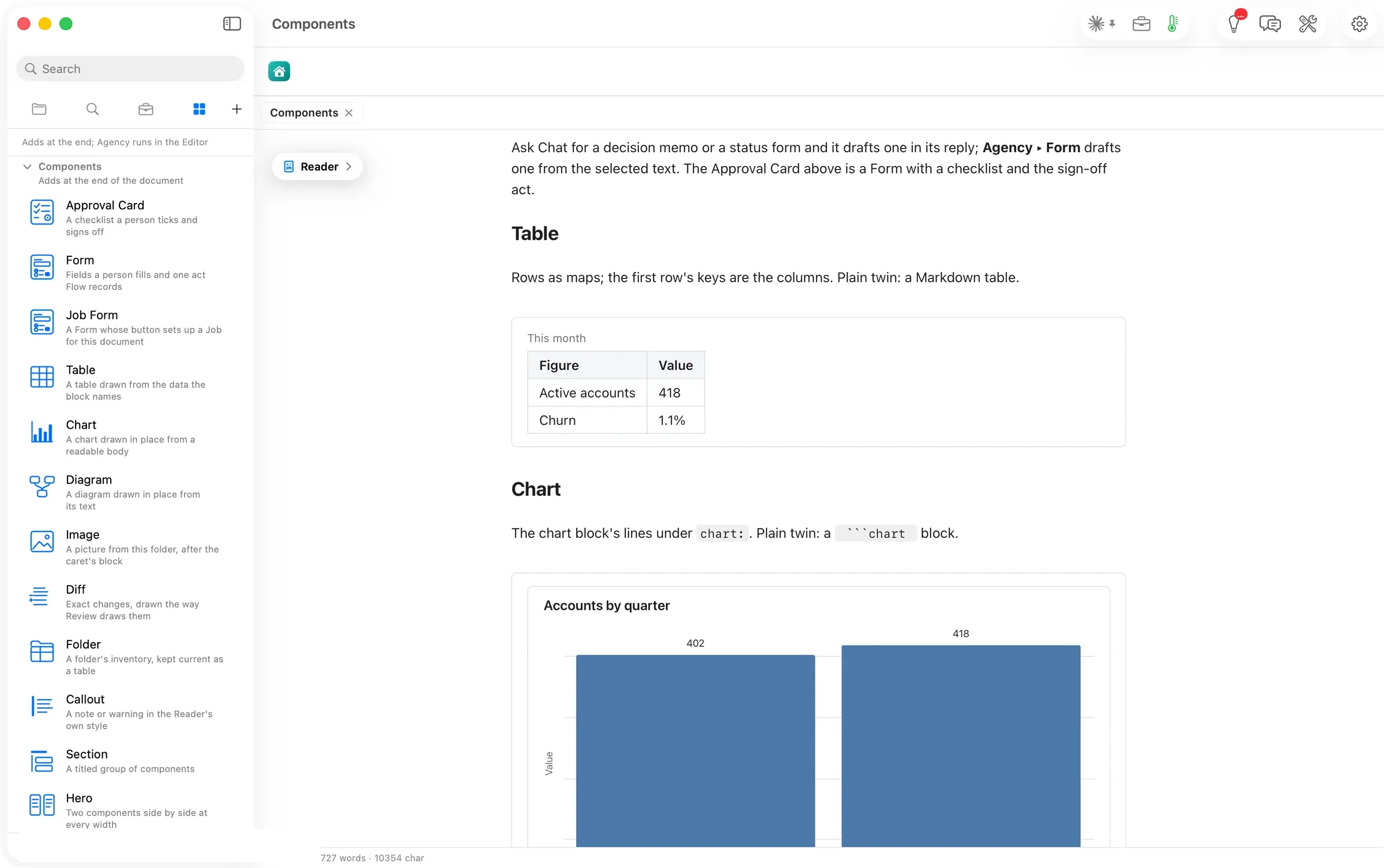
A table drawn from the rows the block names; the first row's keys are the columns.
Its plain twin is an ordinary Markdown table.
```flowui
component: Table
title: This month
rows:
  - {Figure: Active accounts, Value: 418}
  - {Figure: Churn, Value: 1.1%}
```
Components5 of 15
Chart
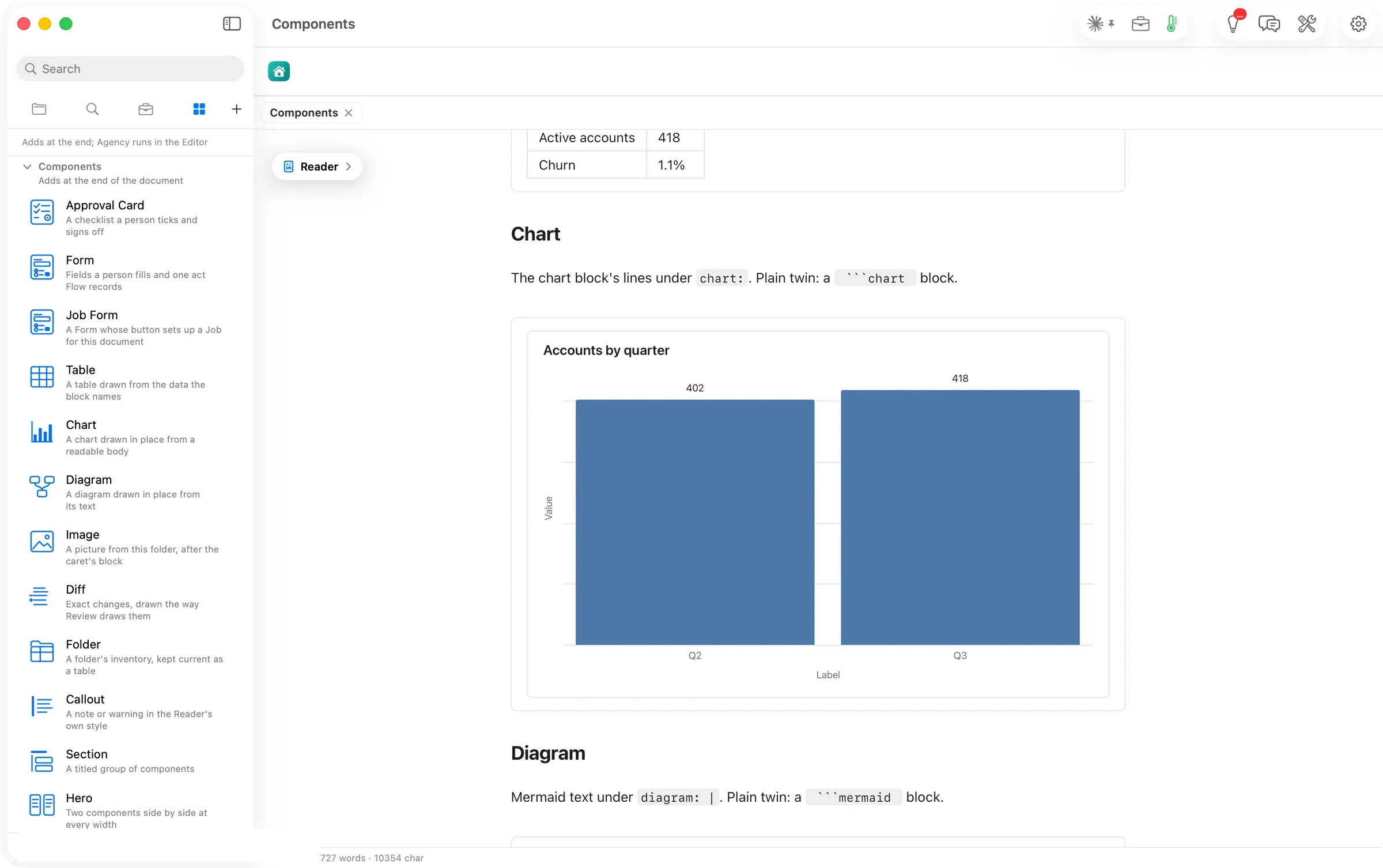
A chart drawn in place from a readable body. It takes the chart's type, title, rows and which field goes on which axis.
Its plain twin is a ```chart block, and the chart kinds article lists all 54 kinds.
```flowui
component: Chart
chart:
  chartType: Bar Chart
  title: Accounts by quarter
  data:
    - {label: Q2, value: 402}
    - {label: Q3, value: 418}
  semantic_types: {label: Category, value: Amount}
  encodings:
    x: {field: label}
    y: {field: value}
```
Components6 of 15
Diagram
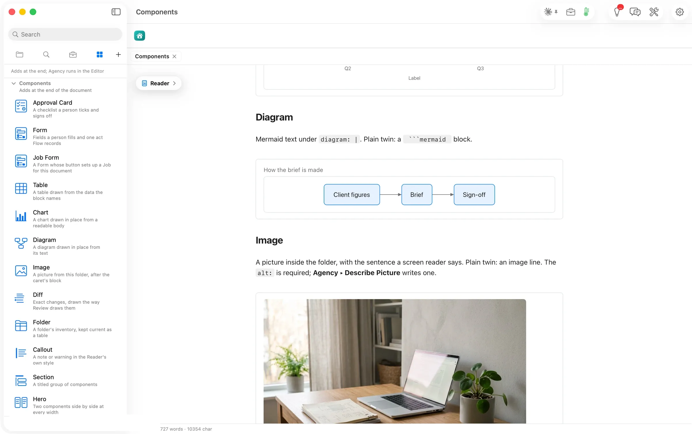
A diagram drawn from its text, in Mermaid's language.
Its plain twin is a ```mermaid block.
```flowui
component: Diagram
title: How the brief is made
diagram: |
  flowchart LR
    A[Client figures] --> B[Brief] --> C[Sign-off]
```
Components7 of 15
Image
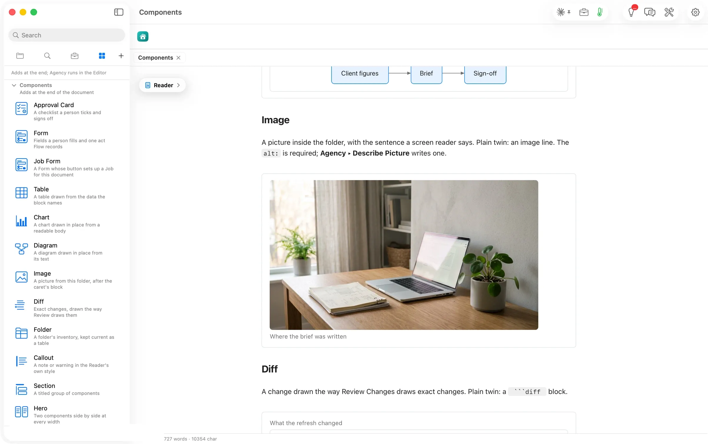
A picture from the document's folder, with the sentence a screen reader says (required) and an optional caption.
Its plain twin is an image line.
```flowui
component: Image
src: assets/quiet-desk.jpeg
alt: A tidy desk by a window, laptop closed
caption: Where the brief was written
```
Components8 of 15
Diff
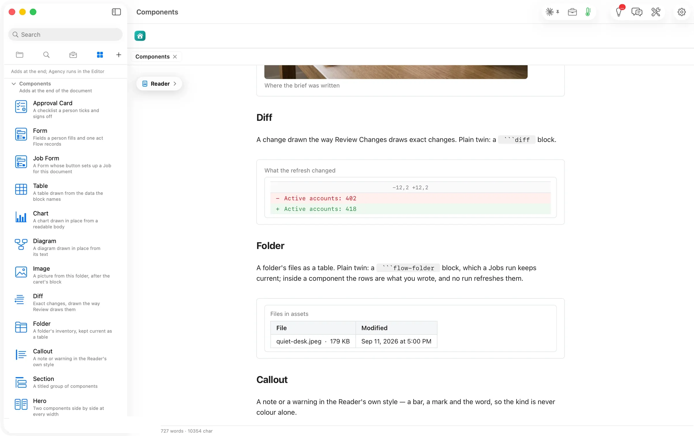
Exact changes, drawn the way Review Changes draws them, red for removed and green for added.
Its plain twin is a ```diff block.
```flowui
component: Diff
title: What the refresh changed
diff: |
  @@ -12,2 +12,2 @@
  -Active accounts: 402
  +Active accounts: 418
```
Components9 of 15
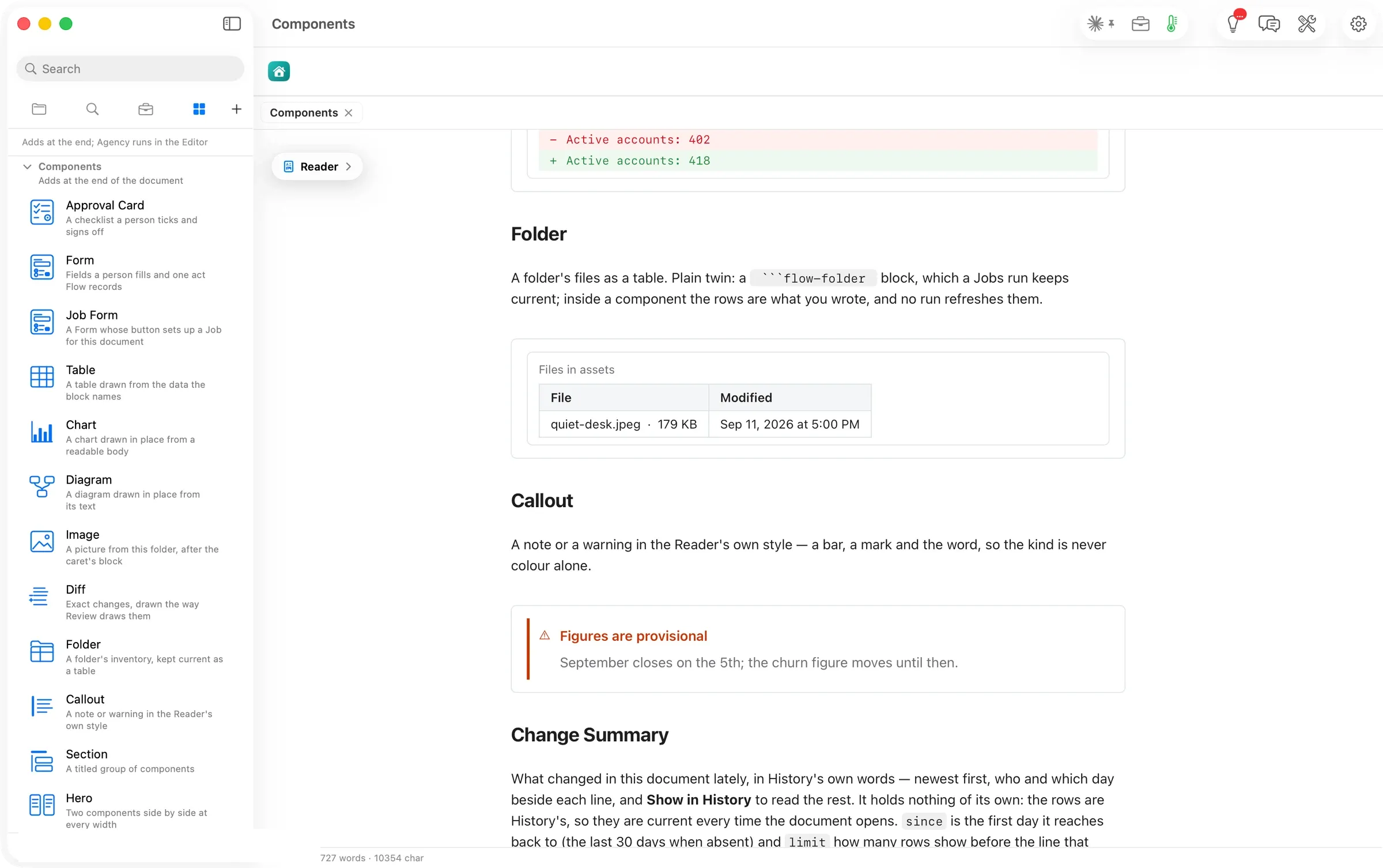
Folder
A folder's files as a table.
Inside a component the rows are what you wrote. Its plain twin, a ```flow-folder block, is the one a Job keeps current.
```flowui
component: Folder
folder: assets
rows:
  - {File: quiet-desk.jpeg, Size: 178715, Modified: 2026-09-12}
```
Components10 of 15
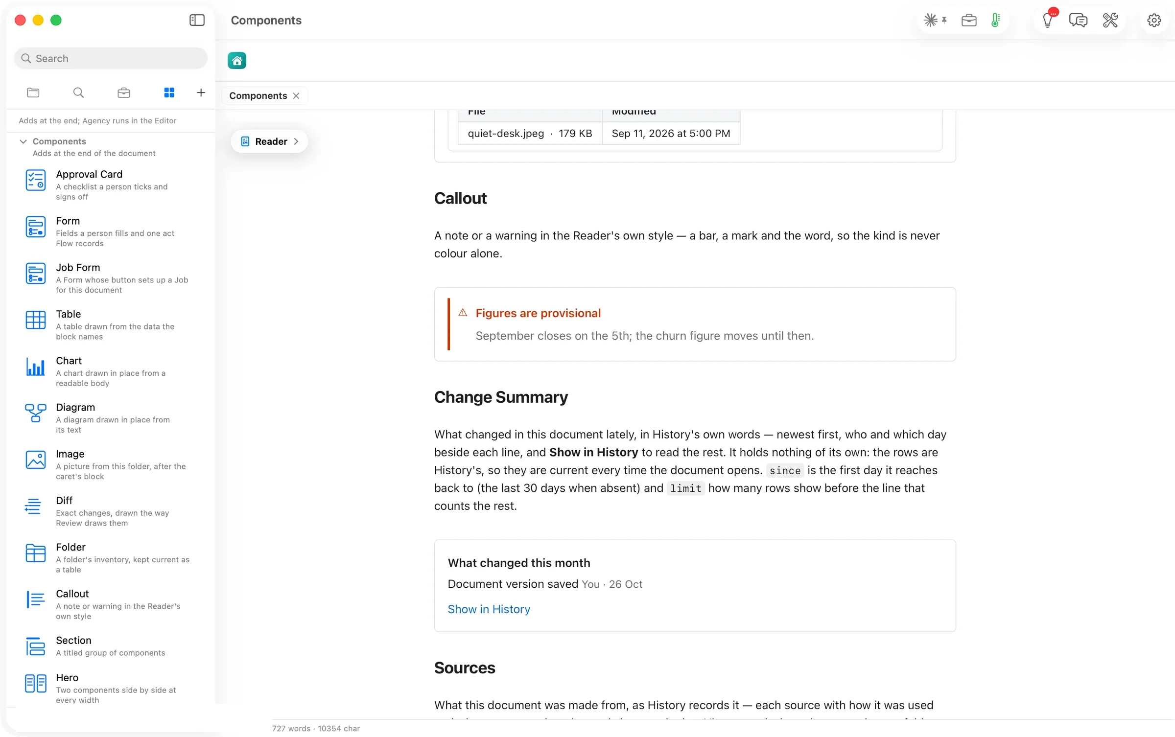
Callout
A note or a warning in the Reader's own style. It has a bar, a mark and the word, so the kind never rests on colour alone.
```flowui
component: Callout
kind: warning
title: Figures are provisional
text: |
  September closes on the 5th; the churn figure moves until then.
```
Components11 of 15
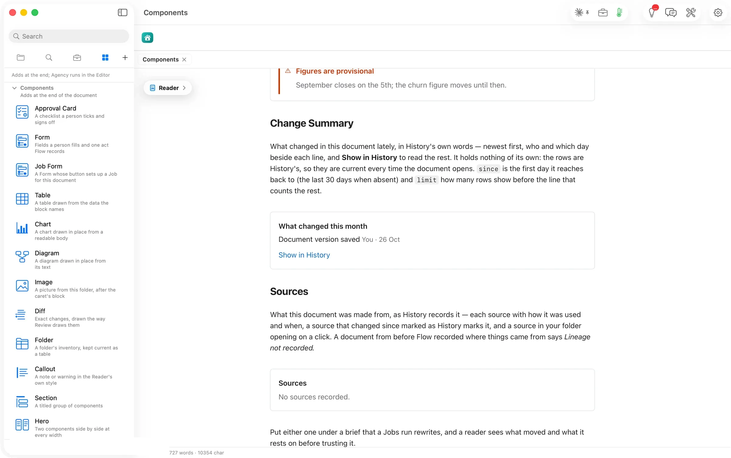
Change Summary
What changed in this document lately, in History's words, newest first, with who and which day beside each line and Show in History for the rest.
It holds nothing of its own, so it is current every time the document opens. since sets the first day it reaches back to, and limit how many rows it shows.
```flowui
component: Change Summary
title: What changed this month
since: 2026-10-01
limit: 5
```
Components12 of 15
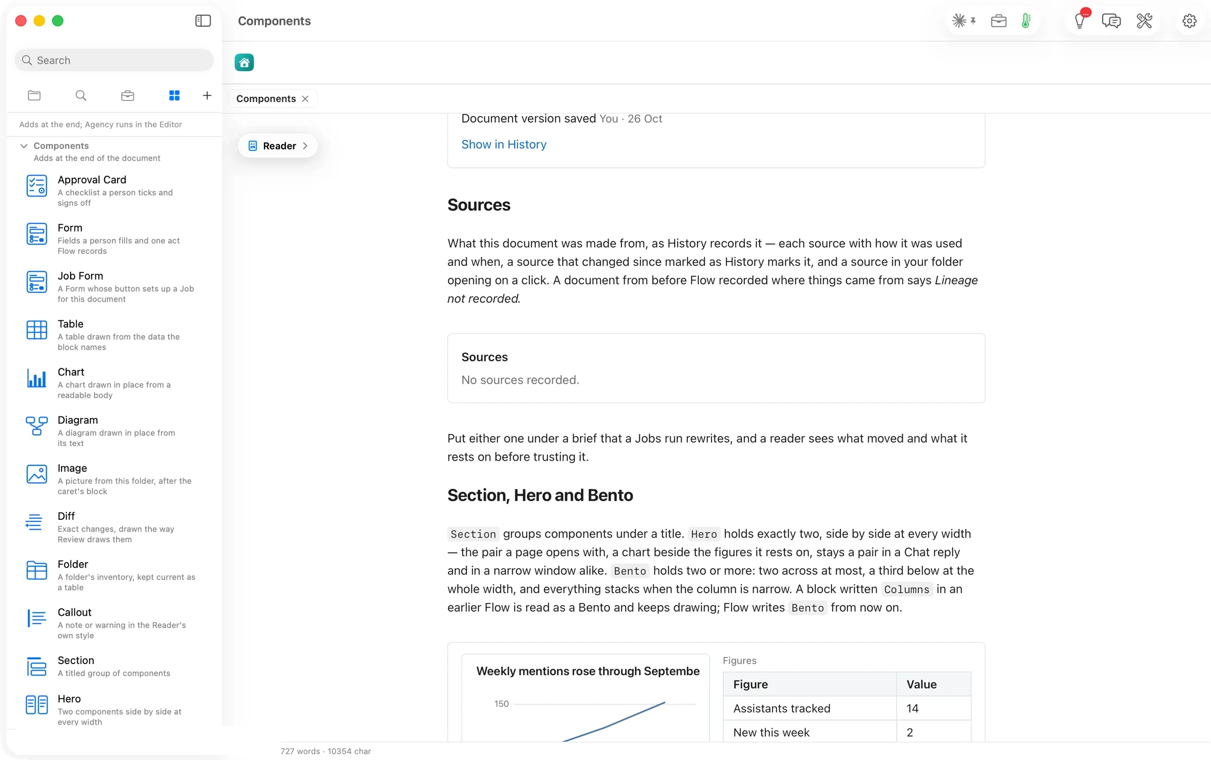
Sources
What this document was made from, as History records it. It lists each source, how it was used and when, with a changed source marked.
It takes no inputs. On a page Flow has no record for, it says so.
```flowui
component: Sources
```
Components13 of 15
Section
Section groups components under a title.
The walk covers Section together with Hero and Bento.
Section groups components under a title. Hero holds exactly two, side by side at every width. A chart beside the figures it rests on stays a pair even in a narrow window. Bento holds two or more, two across at most, and stacks when the column is narrow.
```flowui
component: Hero
components:
  - component: Chart
    chart:
      chartType: Line Chart
      title: Weekly mentions rose through September
      data:
        - {week: "2026-09-07", mentions: 120}
        - {week: "2026-09-14", mentions: 134}
        - {week: "2026-09-21", mentions: 151}
      semantic_types: {week: Category, mentions: Amount}
      encodings:
        x: {field: week}
        y: {field: mentions}
  - component: Table
    title: Figures
    rows:
      - {Figure: Assistants tracked, Value: 14}
      - {Figure: New this week, Value: 2}
```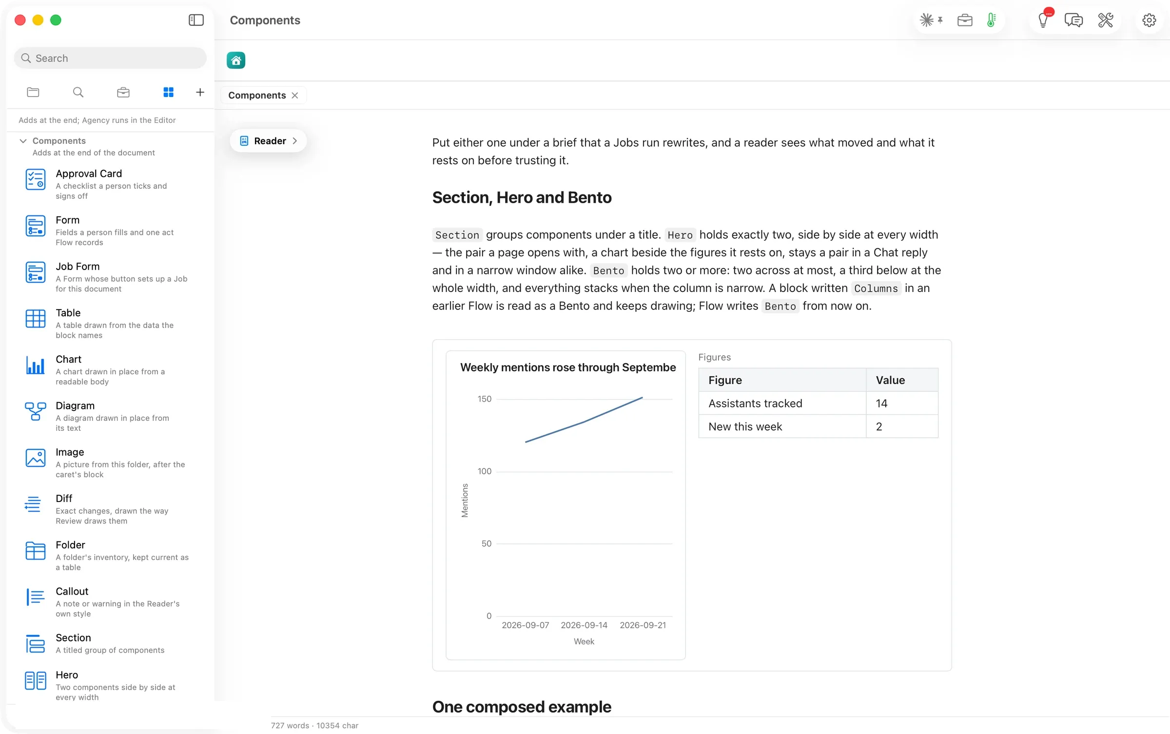
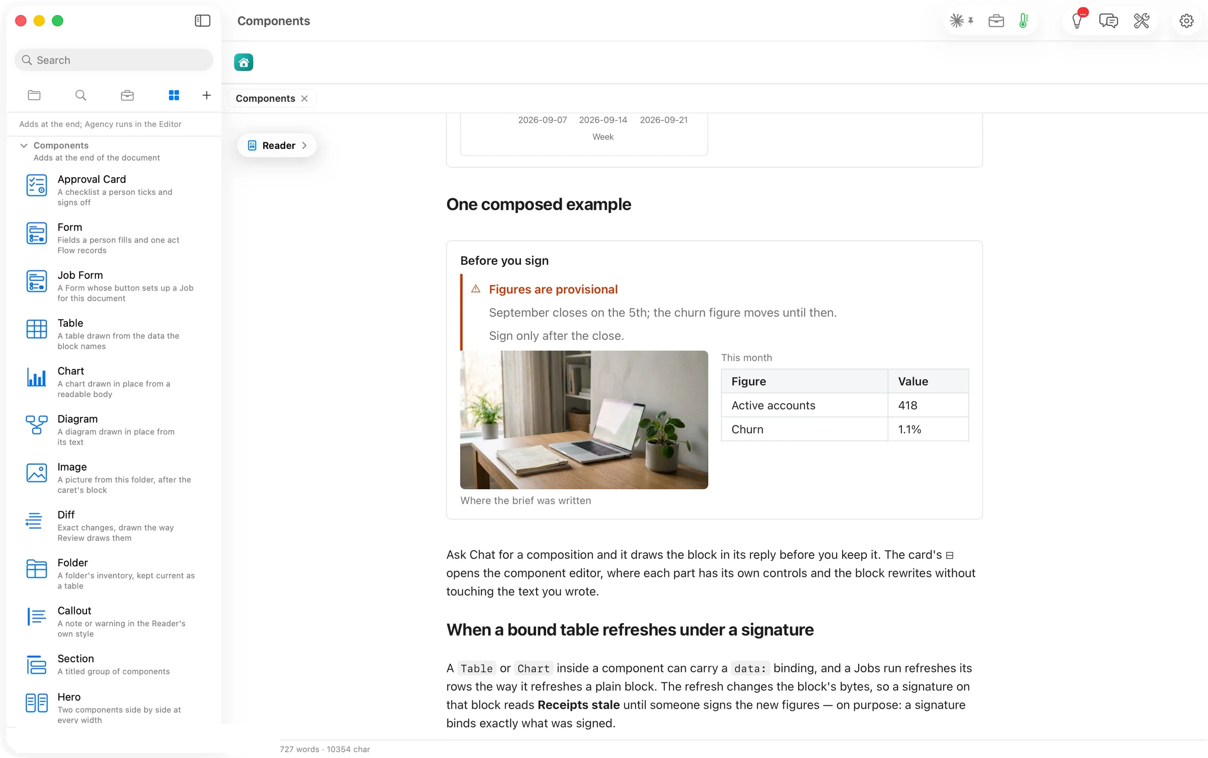
Composed, they read as one panel. Below, a Section titled Before you sign holds a warning and a Bento with the picture and the month’s table.
Components14 of 15
Hero
Hero holds exactly two, side by side at every width. A chart beside the figures it rests on stays a pair even in a narrow window.
The walk covers Hero together with Section and Bento.
Section groups components under a title. Hero holds exactly two, side by side at every width. A chart beside the figures it rests on stays a pair even in a narrow window. Bento holds two or more, two across at most, and stacks when the column is narrow.
```flowui
component: Hero
components:
  - component: Chart
    chart:
      chartType: Line Chart
      title: Weekly mentions rose through September
      data:
        - {week: "2026-09-07", mentions: 120}
        - {week: "2026-09-14", mentions: 134}
        - {week: "2026-09-21", mentions: 151}
      semantic_types: {week: Category, mentions: Amount}
      encodings:
        x: {field: week}
        y: {field: mentions}
  - component: Table
    title: Figures
    rows:
      - {Figure: Assistants tracked, Value: 14}
      - {Figure: New this week, Value: 2}
```
Composed, they read as one panel. Below, a Section titled Before you sign holds a warning and a Bento with the picture and the month’s table.
Components15 of 15
Bento
Bento holds two or more, two across at most, and stacks when the column is narrow.
The walk covers Bento together with Section and Hero.
Section groups components under a title. Hero holds exactly two, side by side at every width. A chart beside the figures it rests on stays a pair even in a narrow window. Bento holds two or more, two across at most, and stacks when the column is narrow.
```flowui
component: Hero
components:
  - component: Chart
    chart:
      chartType: Line Chart
      title: Weekly mentions rose through September
      data:
        - {week: "2026-09-07", mentions: 120}
        - {week: "2026-09-14", mentions: 134}
        - {week: "2026-09-21", mentions: 151}
      semantic_types: {week: Category, mentions: Amount}
      encodings:
        x: {field: week}
        y: {field: mentions}
  - component: Table
    title: Figures
    rows:
      - {Figure: Assistants tracked, Value: 14}
      - {Figure: New this week, Value: 2}
```
Composed, they read as one panel. Below, a Section titled Before you sign holds a warning and a Bento with the picture and the month’s table.
Elements ▸ Components lists every block Flow draws inside a document. They are a checklist a client signs, a form with one act Flow records, a table, a chart, a diagram, a picture, a diff, a folder's inventory, a note or warning, side-by-side layouts, and two blocks that show what changed and what the document was made from. Each is stored as a few readable lines in the Markdown file, so the document still opens anywhere. In this walk a warning went into a plan from its card, was filled in with a live preview, and was written back as five lines.
What Flow does
A Flow document can now hold the parts a real deliverable needs, and every one of them is still plain text.
Open Elements (⌘5) and the Components section lists fifteen blocks, each with a drawing and one line. Press one in the Editor and Flow places a starter after the caret and opens the component editor. It shows the block’s fields as controls, and the block drawn live above them. Press Apply and you are back in the document on the line after it. In the file, a component is a ```flowui block of a few YAML lines, such as component: Callout and kind: warning, so the document reads the same in any editor and Flow draws it as one of its own surfaces. A checklist records its signature beside the document rather than in it. A form records its one act after asking. A Job Form sets up a Job that keeps a section current. Hero and Bento put two components side by side.
The answer first
- Open a document in the Editor and put the caret where the block should go.
- Press ⌘5 and press a card under Components. Flow writes a starter after the caret and opens the component editor. From the Reader, the card adds the block at the end of the document instead.
- Fill in the fields. The block redraws above them as you type.
- Press Apply (⌘↩). The Editor comes back with the caret on the line after the block.
- To change it later, hover the block and press its ⊟, or put the caret in it and choose Format ▸ Edit Component. Format ▸ Insert Component lists the same blocks.
The job
A deliverable is rarely only prose. A monthly brief needs its figures in a table, a chart beside them, a warning that the numbers are provisional, and a place for the client to sign. A status page needs a form whose answer lands in the document. In most editors these parts live elsewhere. They sit in a spreadsheet, an e-signature service, a slide. Flow draws them inside the document and keeps them as text the document owns.
From the card to the page
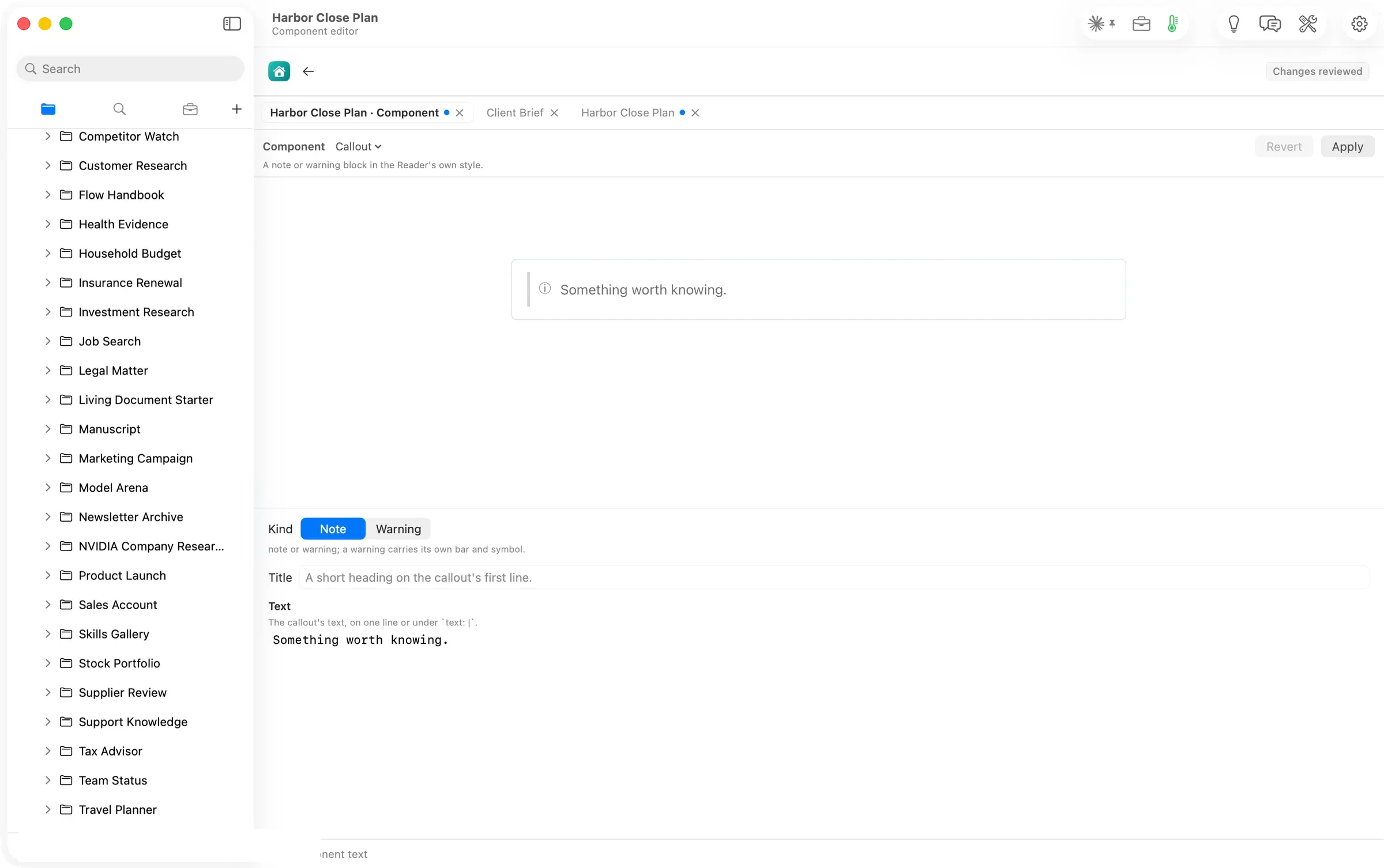
On Harbor Close Plan, with the caret after the Risks paragraph, the Callout card opened the component editor. The starter reads Something worth knowing. The controls are the Callout’s inputs: Kind (Note or Warning), Title and Text.
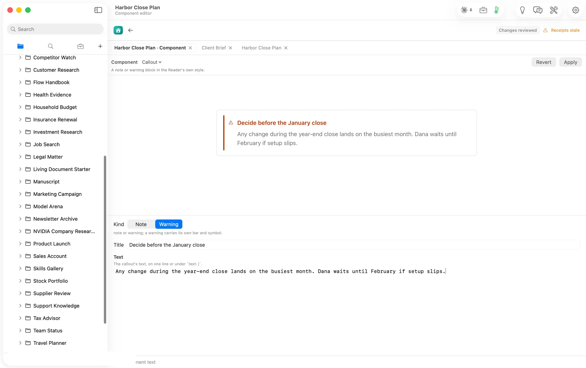
Choosing Warning and typing a title and a sentence redrew the preview as each field changed.
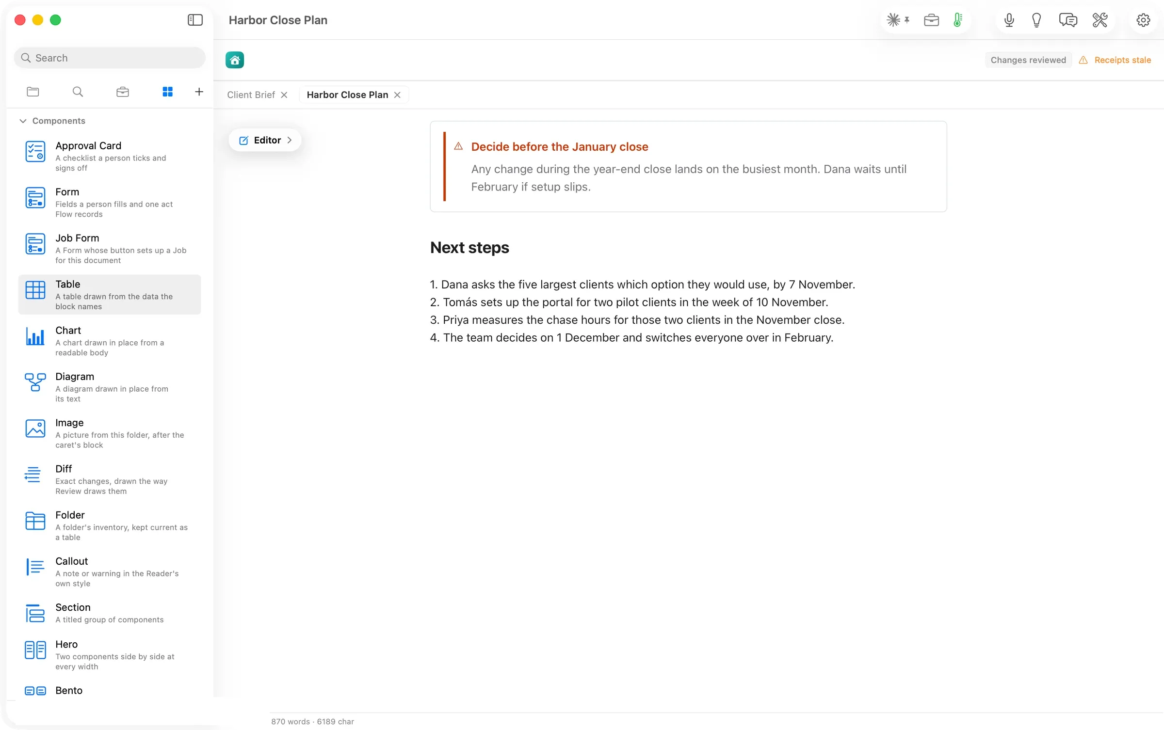
Apply returned to the plan with the warning drawn above Next steps, and Elements came back where it was. In the file the block is five lines:
```flowui
component: Callout
kind: warning
title: Decide before the January close
text: Any change during the year-end close lands on the busiest month. Dana waits until February if setup slips.
```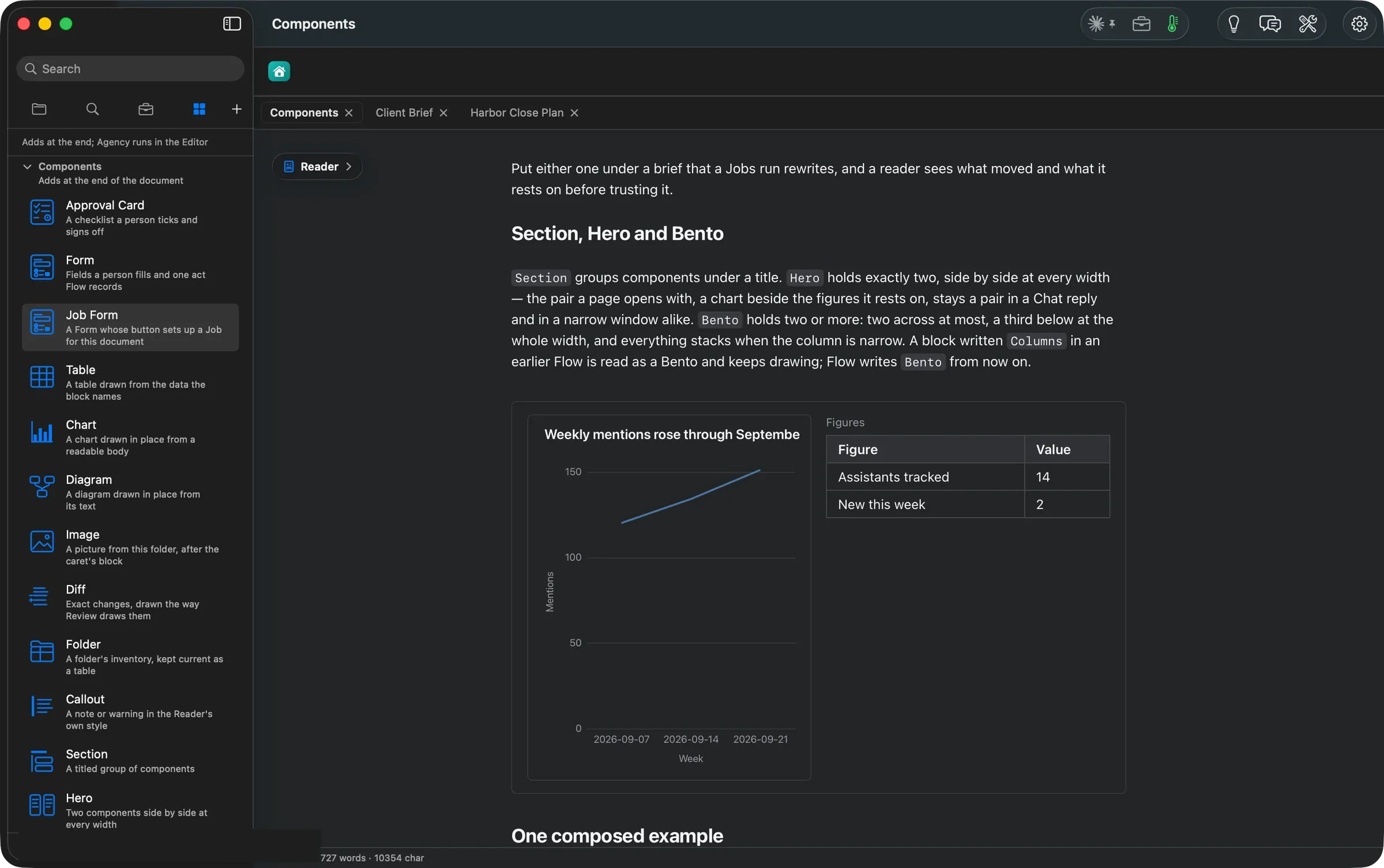
Every component redraws for dark mode.
Two Agency actions draft components from your own words. Sign-off drafts an Approval Card and Form drafts a form, and both arrive in Review Changes; the Agency article shows each. Ask Flow Chat for a status form or a composition and it draws the block in its reply before you keep it.
The numbers
| Figure | Value | Status and source |
|---|---|---|
| Cards under Components | 15 (14 blocks plus Job Form) | verified: the panel’s list, read 14:26 |
| Form field kinds | 6 (text, number, date, one choice, any of several, checklist) | verified: the Handbook’s Components page |
| Form acts | 5 (submit, decide, rate, sign-off, update) | verified: the Handbook’s Components page |
| Lines the Callout took in the file | 5 inside its fence | verified: the file read back after Apply, 14:28 |
| Cost of inserting and editing a component | none | assumed: the insert and the component editor showed no route or cost line, unlike every model run in the set |
| Machine | MacBook Pro M3 Max, 36 GB, macOS 26.6 | verified |
Walked on: Orionfold Flow review build elements-1 (dev, main d43eb7f2), macOS 26.6, MacBook Pro M3 Max 36 GB, window 1512×949; walked 2026-10-26 13:55–14:29 PDT by the agent in an away session, one Flow instance.
Data: The Flow Guide's Handbook ▸ Components page (Harbour Analytics, fictional) and Harbor Close Plan, a fictional plan written for this walk. The account row is painted over in every shot.
Written by the Flow product team from the walk's own records. Numbers are labelled verified, derived, assumed or unknown.
MORE ELEMENTS
Another group,
walked the same way.
Elements: everything a document can take, one card at a time
Every block, action, skill and chart kind in one sidebar, and Ideas naming the skill that fits each section.
Twelve things Flow can do to your words, each waiting for your yes
Twelve actions on your words, from proofread, summarize and translate to tables, charts, sign-offs and forms. Each waits for your yes.
Nineteen skills that draw your document's case for you
Nineteen skills that turn a passage into a decision brief, a roadmap, a register or a figure you step through.
Fifty-four ways to draw your numbers, and what each one needs
Fifty-four chart and diagram kinds, each with the data it takes. Switch kinds and keep your data, on your Mac, with no model involved.